L i f e A l e r t
Changing Brand Perception with UX Design
Life Alert
Life Alert has a shrinking market share in the medical industry as competitors continue to enter the market.
The current Life Alert website struggles to communicate the available options and services to the new users and does not live up to the expectations of the current users
Problem
Our Goals
Identify the disconnect between the product and the users.
Identify emerging segment of new users and connect with them
Create an impactful web presence for existing and new users that can fulfill their goals
User Experience Student
My Role
User research/ Interviews
Competitive analysis
User sentiment analysis
Persona Study
Storyboarding
User flows
Information architecture
Wireframing
Usability testing
Techniques
Google Analytics
Sketching
White Boarding
Photoshop
Sketch
Tools
User research
Personas
Wireframes
Clickable prototype
Key Deliverables
Our Team
Swapna Kulkarni
Mari Hasu
Scope-
Open
User Research
User Interviews
Our Test users
-
Young professionals who grew up watching Life Alert commercial on TV
-
Adults who pushed the boundaries of social norms to lead a purposeful and active life
-
Elderly who believed in catching up with the internet times
All of them were aware of Life Alert - In a totally different light.

"Life Alert! what a joke! That's not for me!"
"I havn't fallen down and I don't need a Life Alert."
" Even my grandpa thinks Life Alert is dated!"
User identified with the Life Alert parodies than the actual brand
User Research
Current User Experience

-
Inconsistent Design Standards
-
Confusing navigation
-
Confusing discovery
-
Confusing User flows
-
Lack of Hierarchy
-
Lack of personal user space ( account)
-
Fragmented information
User Task: Select a product suitable for you and purchase it

Answer to the every user query
Users could not complete a basic task of finding a product and purchasing it online
User Research
Quantitive User Surveys
How users felt about Life Alert?
Its not for me
I am too young for medical alert
Its for old, lonely people
Its for disabled people
Its for sick people
I don't need it
How users felt about the website?
Too much content
Too many colors
Too many fonts
Too many buttons
Too exhausting
Too confusing
Inadequate
Frustrating
What user expected from LA website?
Find more about LA products
Figure out which product is best
suited for me
Compare pricing
Buy product online
Most of our test users said they will not have Life Alert as their primary medical alert system
User Research
Key Findings
Existing web presence of Life Alert did not connect with users functionally or emotionally
And the STIGMA associated with the brand was far more severe to the users.
Users associated Life Alert products with a sign of weakness and old age
What if Life Alert was not a joke?
And we could actually motivate users to feel empowered with Life Alert?
Brainstorm & Ideation
Persona Study

-
Ambitious career woman, Tech-savvy
-
Has a job of her dreams
-
Often works late at night and walks alone
-
Does not want to give up on her career
-
Personal safety is important to her
-
Does not want to call 911 every time she walks alone
Cathie, 46
Has a Demanding Career

Edith, 75
Strong, Independent Woman
-
Strong Independent Woman
-
Minor health problems
-
Enjoys living in her own home
-
Cultivates many hobbies
-
Enjoys spending time with friends
-
Wants to live life on her terms
-
Wants to be prepared in case of health emergency

Brad, 19
Wants an active life style
-
Young, Tech-savvy teenager
-
Has a medical condition
-
Wants to enjoy his life like other teenagers
-
Wants to be pro-active in case of emergency
-
Does not want his parents tobe worried about him.
Brad's Scenario

Brad is always just one push away from appropriate help. When he pushes the help button on Life Alert mobile, help can arrive already knowing his condition and how to treat it.

Concept Map - Persona concerns, motivations, goals
Design Goals
-
Appropriate Hierarchy
-
Consistent design standards
-
Easy navigation
-
Easy user flows
-
Helpful discovery
Branding Goals
-
Brand Awareness
-
User Education
-
Positive Association
-
Emotional Engagement
-
Strength , Courage , Hope
-
Address age related stigma
Site Map

Brad's User flow - Informative
Cathie's User flow - To the point


Edith's User flow - Traditional

DESIGN
Initial Iterations

Home 1

Home 2

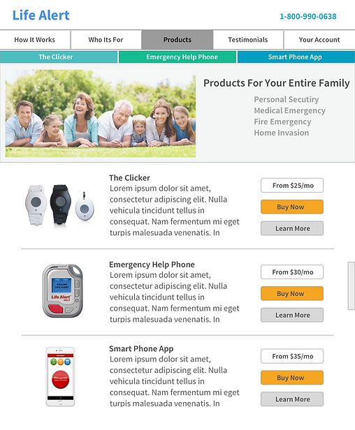
Product Listing Page

Product Detail Page
Simplified Check Out

Initial User Testing
-
Increase Discoverability
-
Tie user goals to the appropriate products
-
Make user account visible
-
Too many calls to action
-
Work on the color guide
-
Checkout could be one easy flow
DESIGN
Initial Wireframes - Creating Hierarchy


Home Page
Product List Page
Product Detail Page
Brand Awareness
DESIGN
Low -fi mockups

Findability
Colors -
Calm, cool, peaceful
Images-
Happy, smiling
Confident, positive
Brand Awareness
Connecting with users of varied age
demographic
User Education
Most popular
Products
Clear call for action

Efficiency
Most popular products
Inclusive of all
age groups
Overview of products
Readability

Convenience
See reviews.
Product Overview
Pricing Information
For new users
For traditional users
Product features
explained

Brand Awareness
User Stories
Recommendations
User Feedback
-
Content structuring was helpful
-
Navigation was efficient
-
Products were easily discoverable
-
It was easy to learn which product was best suited
-
Comparing products and buying them online was easy
-
Sense of positive feeling
-
Users from various age group could relate to the products
-
Search feature was missing
-
Call to action could be more clear on the home page
Key Takeaways
User research is the most vital part that can lead to correct design decisions.
UX process can help enhance user experience as well as brand perception